Table of Contents
Introducing 10 Web Design principles to have a good quality website.
Quality Web Design is important to create a positive user experience, attract more visitors and close sales opportunities. CIPHER, a comprehensive digital marketing service provider, specializes in designing and developing websites that meet business requirements with professional consulting teams. And watch closely.
What is Web Design?

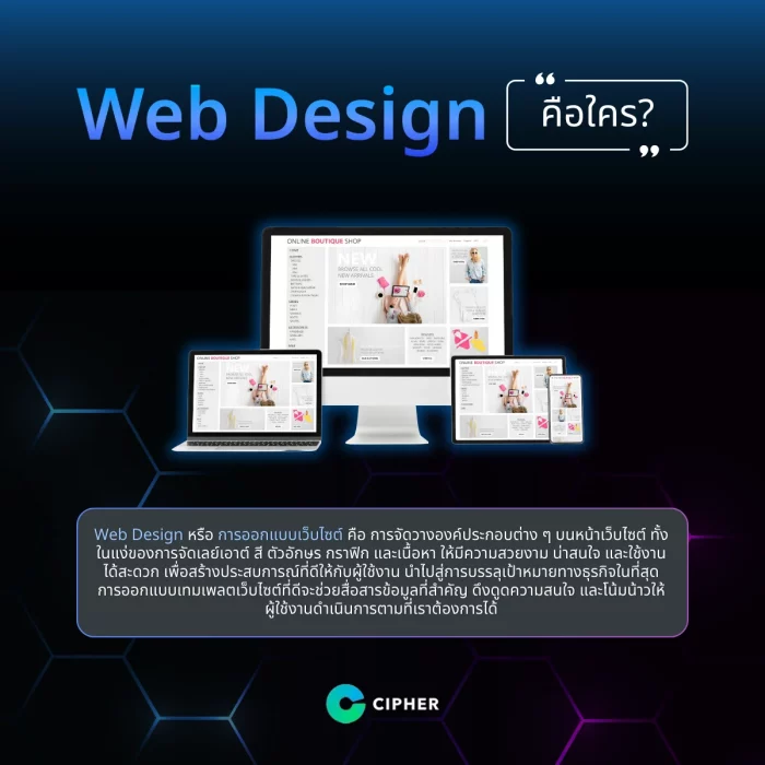
Web Design is the layout of components on the web page in terms of layout, color, font, graphics and content to create a pleasant and convenient user experience that ultimately leads to business goals. And convince the user to take the action we want.
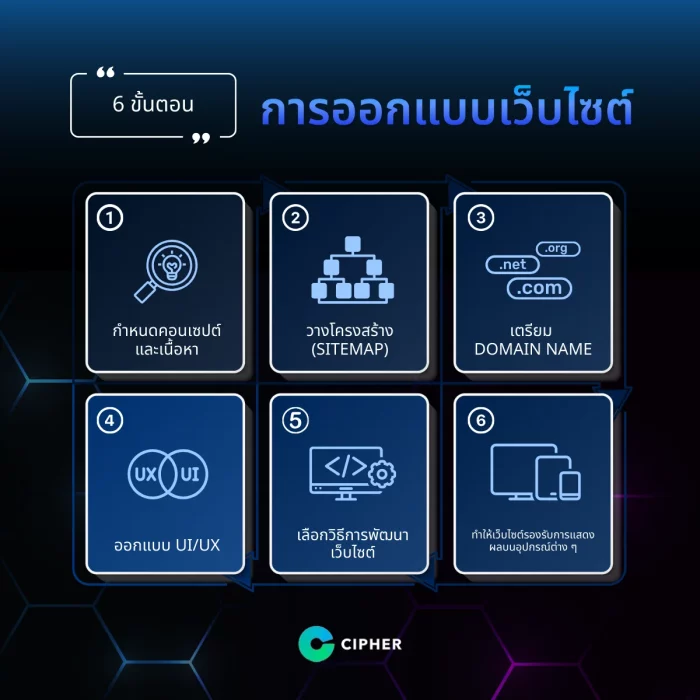
6 Web Design Phase
Designing a good website must begin with systematic planning. To achieve a beautiful website, it works seamlessly and meets business goals. Designing the website requires a deep study of the needs of users, user behavior, and User Journey.

- Define the concept and content clearly that websites will have a purpose and need to communicate. What needs to be analyzed by target groups, competitors and design directions that are consistent with the brand?
- Structure (Sitemap) of websites, categorize web pages, prioritize, and systematically correlate pages to make browsing easier for users and search engines.
- Prepare the domain name or website name in a concise, easy-to-remember, business-friendly way. There may be keywords related to products or services and the appropriate TLD should be selected.
- UI/UX is beautiful, easy to understand, convenient to use in line with the concept and target group. The design principles include Visual Hierarchy, Color Psychology, Typography, etc.
- Choose how to develop the website. Whether to make your own or use tools to suit your needs and budget. Whether you write your own code or use CMS such as WordPress, you must choose to match your skills and resources.
- As a result, the website supports responsive display on devices to reach users anytime, anywhere. Whether they use a mobile phone, tablet or desktop, the content and components must be optimized on any size of the screen.
The design of the website should be carefully and flexibly adjusted to suit the user’s feedback. The website is not a frozen thing, but needs to be developed constantly to keep up with changing consumer behaviour and market trends.
10 Principles of Designing a Web Site to Be Interesting
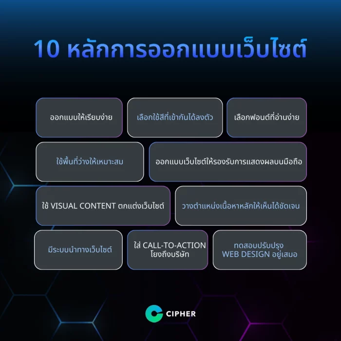
Designing a good and efficient website is about art and art that combines multiple design principles to provide visitors with the best user experience, whether it be aesthetics, simplicity, color, layout, composition or navigation, all of which are important factors that promote user awareness and participation. The following are the 10 web design principles that professional designers often use as a way to create works.

1. Designed to be simple.
Focus on simplicity, simplicity, ease of focus on important content and not be confused with unnecessary content. Minimal design allows fast loading, easy screen resizing and making users want to read more content, but should not be smoothed out of focus. It must be unique enough to catch the eye and impress the brand.
2. Choose a color that matches perfectly.
Choosing the right color helps create the mood and attractiveness of the website. Apart from having to use color to match the color tone and personality of the brand, the Color Harmony that harmonizes colors, is not too flashy, has contrast that makes it easy to read and not too many colors to keep the website clean and professional.
3. Select an easy-to-read font.
Fonts have a significant impact on the convenience of reading content. Fonts that are easy to read should be selected, comfortable, and comfortable with line spacing. Focus on standard fonts such as Sans-serif fonts such as Arial, Verdana, Helvetica or Serif fonts such as Georgia, Times New Roman For the main content, you should not use too many exotic fonts or mix many fonts that are difficult to read and must select the font size to suit the display on various devices.
4. make the right use of free space
White Space, or free space, helps to separate parts of the content, makes it neat, uncomfortable, highlights the key points and improves eye-friendly reading. Aligning the space, whether it’s between elements, edge or background, makes it easier for users to focus on important content. However, the gap should not be so large that it seems to be wasting space that it is necessary to find a proper balance.
5. design a website to support mobile display
In an increasingly mobile era, responsive website design that adapts displays to different screen sizes is essential. Whether it’s on a smartphone, tablet or desktop, it needs to display complete content, images, and functions. Considering the layout of the typeography, graphics usage, to the size and location of buttons. That must be easy to use on every screen, both vertically and horizontally.
6. Use Visual Content to decorate websites
Visual Content, whether in pictures, icons, infographics or videos, makes the website more interesting, makes it more vivid, can communicate emotions and meanings more clearly than text alone, and can explain complex content easily and create brand recognition better than text. Visual Content should be selected to suit the content and style of the brand. The color tone should be controlled to the same theme and not too much to fit. In addition, the size of the file must be considered to be the right size so that it does not affect the speed of loading the web page.
7. Position the main content clearly.
The site’s content should be in a clear position, immediately noticed by using Visual Hierarchy to prioritize components in terms of size, color, location, space and shape. To get our eyes on the highlights, sales buttons and key messages, it must be highlighted with large selections. Bright colors or geometric shapes so that users don’t miss the information we want to convey.
8. have a web navigation system
A good menu and navigation system makes it easy for users to browse the web, find information they want to spend more time on the web. The menu structure should be organized, categorized, text-rich, easy to understand, and in-depth, using the drop-down menu for subcategories, including Breadcrumb Navigation or Sitemap. To specify the current page location and return to the previous page, and there should also be a search field for convenience.
9. Enter Call-to-Action to link to the company.
Call-to-Action (CTA) buttons, such as “Contact Us” or “View Service Packages,” can easily connect users to company services, transform visitors into target customers. CTA designs require clear text, tightening, color, and location. Staggering the button, but not crammed. There may be many points on the page repeatedly. In order to increase click opportunities, it must be consistent with the content and personality of the brand.
10. Always testing Web Design improvements
Even though the web has been well designed, it should always be tested and improved. As technology trends and user behaviour change throughout the web, the web design must always adapt to best meet the user’s needs. User behavior data should be stored, A/B testing should be performed. Requesting feedback from real users and studying new trends and techniques in the industry to measure, analyze and optimize designs for superior design.
Web design trends are interesting these days.
Web design has always developed new techniques and styles to provide users with a fresh and exciting experience. Designers and marketers must constantly update trends to create cutting-edge, unique websites that meet the needs of each generation. Here are some hot trends to watch.
- Glassmorphism is a very popular design trend, imitating translucent glass with special effects such as blurring, gradient and reflection, making elements lighter, more dimensional and deeper, creating a modern, luxurious feel, but still simple.
- Dark Mode is coming with the world’s most powerful technology by using dark tones as the primary color of the design. It will not only save your eyes and reduce fatigue from staring at the screen, but also save battery power and give you a premium, luxurious and outstanding look over the web.
- Micro-interactions and animations are evolving to the next level with more sophisticated and streamlined detailing, whether it’s a scrolling effect, content change, or a sophisticated user interface based on CSS and JavaScript.
- In the future, it will be even more common to use AI to customize websites based on personal preference information. AI will learn about individual behaviors, such as frequently purchased products, web pages, and specific content and offers, as well as introducing additional products or other related devices. To maximize sales opportunities and personal impressions.
Conclusion
If you’re looking for a professional web design and development expert, CIPHER will provide a full range of professional services to help create a dream website that is both beautiful, modern, convenient and efficient. We’ve got free and close consulting to meet all your business needs. Step into the online future with us with a unique, professional website.
Frequently Asked Questions
The process of designing and building a website has a process. Anything?
The process of designing a website in general can be divided into 6 big steps:
- Defining concepts and content to communicate clearly
- Structuring or Organizing Data Sitemap
- Keeping Domain Name Simple and Business-Compliant
- UI/UX design is both beautiful and convenient.
- Choosing the Web Development Methodology That Fits Needs and Budgets
- Responsive Design should be performed on all devices and can be adjusted according to the user’s feedback so that the website is always up-to-date and responsive.
How many types of website creation are there? Anything?
In general, creating a website can be divided into two main ways:
- Early coding, which is ideal for highly complex Web sites that require specific features, is time consuming and requires a high level of programming knowledge.
- Using a tool or CMS such as WordPress, Wix or Squarespace, which has many templates to choose from, is easy to use, is suitable for people without code foundation, saving time and budget, but there may be some limitations in customization.
Both have different advantages and disadvantages depending on the needs, skills and resources of each business to choose which method is best suited.
What are the four components of the website?
Websites are generally divided into 4 main components as follows:
- Header is the top part of the website. It is used to place logos, main menus, search spaces, and key buttons to help create identity and web navigation.
- Body is the main content of the web, which may consist of text, pictures, videos, or other elements depending on the purpose of each page.
- Sidebar is a column on the side of the Body. It is often used to place sub-menus, ads, or widgets to display additional related information.
- Footer is the bottom part of the web that usually displays contact information, links to social media, web maps or copyrights. All of these sections need to be designed to fit, convenient and communicate the necessary information to users. This is called the perfect website.


