
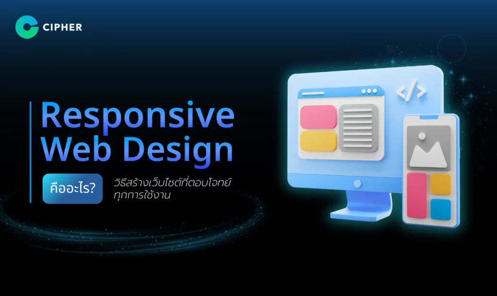
What is Responsive Web Design? Let’s understand all the elements!
It is undeniable that people use a variety of devices to access the internet, from smartphones, tablets to desktop computers, making “Responsive Web Design” the heart of website design. If you have ever seen a website that looks good on a mobile screen but is difficult to use when opened on a tablet or desktop, it shows the importance of designing a design that displays well on all devices.
In this article, we will take you to understand what Responsive Web Design is and why it is an important tool in website design. Let’s see how this approach can help improve the user experience!
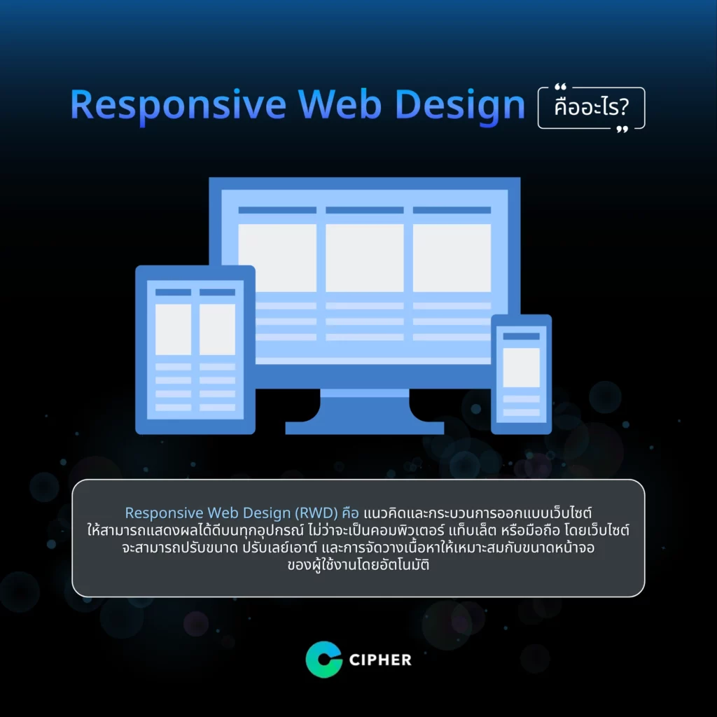
What is Responsive Web Design?
Responsive Web Design (RWD) or Responsive Design is the concept and process of designing a website that can be displayed well on all devices, whether it is a computer, tablet or mobile phone. The website will be able to adjust the size, layout and content arrangement to fit the user’s screen size automatically.
Key principles of Responsive Web Design
The key principles of Responsive Web Design (RWD) or Responsive Design are what will help the website to be displayed effectively on all devices. The key principles of Responsive Web Design consist of 3 main parts that help the website adapt to the screen size and device of the user, including
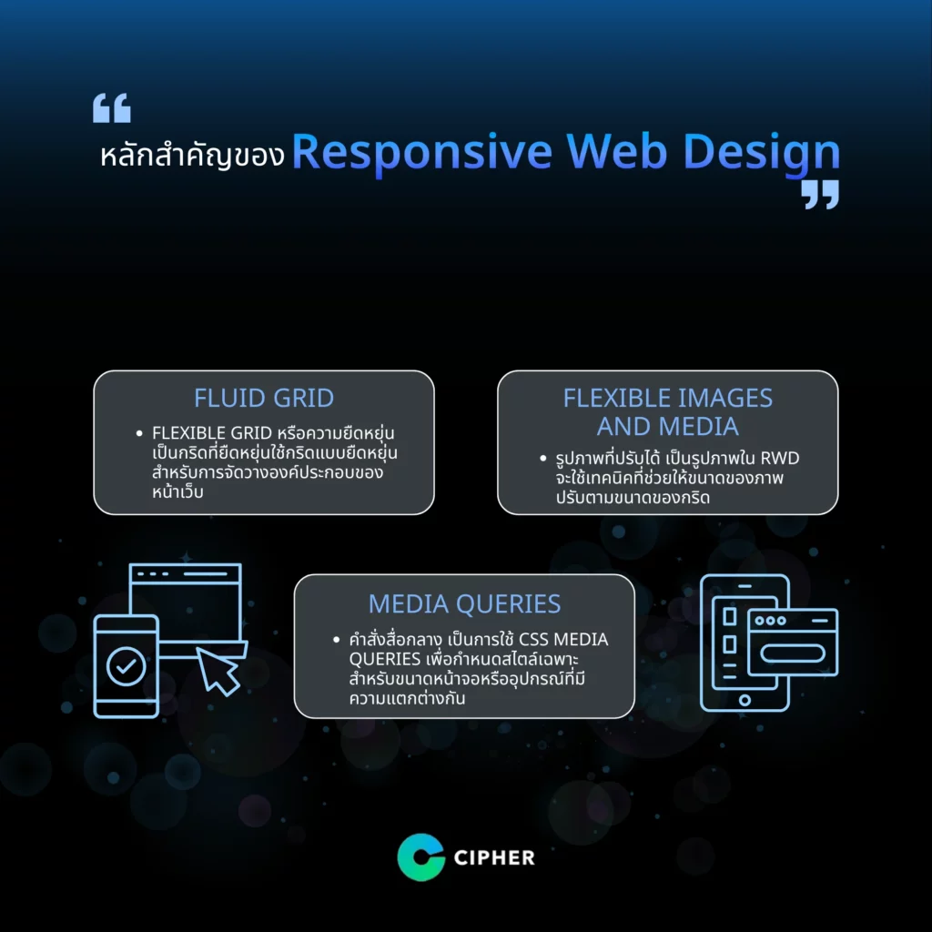
Fluid Grid
Flexible Grid or Flexible is a flexible grid that uses flexible grid for layout of page elements such as text and images to optimize proportions across all screens, often in percentage (%), em or rem, instead of using fixed unit px to optimize screen size on each device.
Flexible Images and Media
Flexible Images or Adjustable Images as RWD images will use techniques that allow image size to be adjusted according to grid size, for example:
-
- Set the image width to max-width: 100% to prevent the image from exceeding the screen border.
- Use high-quality and small file formats to avoid impacting site speed.
Media Queries
Media Queries or media commands use CSS Media Queries to define specific styles for different screen sizes or devices, such as:
-
- Reassigning layout: when screen width is less than 768px
- Small screen (mobile): Hide some elements
- Large screen (desktop): add a column or more detailed layout
7 Benefits of Responsive Web Design
Responsive Web Design (RWD) is a key factor for modern website development. There are a variety of benefits that enhance the website’s experience and productivity in several areas:
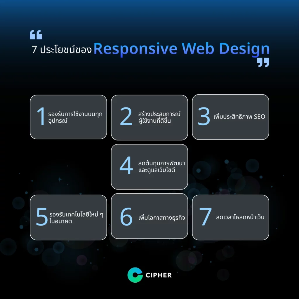
1. Supported on all devices.
The website is optimized for any size screen, whether it’s a computer, desktop, laptop, tablet or mobile.
-
- It allows users to have a great experience without moving left, right or zooming in and out.
- This simplifies the creation of a separate website for each device.
2. Create a better user experience
-
- Proper display of content makes it easy for users to read and interact with websites.
- Increase user satisfaction, making it more likely to re-use.
- Reduce Bounce Rate
3. Enhanced SEO (Search Engine Optimization)
Google recommends using Responsive Web Design because it can help manage content to suit every screen and device.
-
- It has the same URL and the same HTML for all devices, making it easier to rank in search engines.
- Reduce Duplicate Content Problems
- Faster page loading, which is an important factor in ranking on Google search engines.
4. Reduce development and maintenance costs for websites
-
- There is no need to create or maintain separate websites for mobile and desktop, reducing unnecessary expenses.
- Use fewer resources to update or update sites because all platforms use the same code.
5. support future new technologies
-
- RWD makes it easy for websites to adapt to new technologies or devices such as smart TVs or Wearables devices.
- Resize and lay out even if the device technology changes.
6. increase business opportunities
-
- Online shopping is also supported by the increasing use of smartphones.
- This will increase the opportunity to change visitors to customers (Conversion Rate) because it is easier to use.
- Promote the brand image to look modern and meet the needs of users.
7. Reduce page load time
-
- Designed to fit each screen, reduce unnecessary content loading
- This helps improve loading speed, which has a positive impact on the user experience and SEO.