
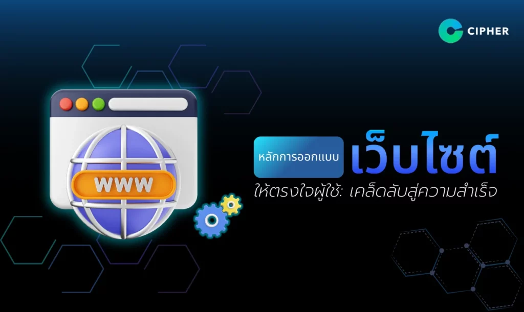
CIPHER’s website design principles address the user’s needs that CIPHER places importance on.
There is no denying that the website has become an important area of user experience and impressions. Thus, the design of the website takes more than beauty but meets the needs of the users.
At CIPHER, we believe that the heart of successful website design is to balance the user experience and brand identity. All elements of the website, structures or content presentation, are developed with attention to provide the best user experience and a clear reflection of the business. In this article, you will explore the “Design Web Principles” that not only address the user’s needs, but also give businesses a sustainable edge in the online world.
Why is it so important to design a website that meets the user’s needs?
It is important to design a website that meets the needs of users because it directly affects the user experience (UX), especially business websites where image and reliability are important. Therefore, it is not overlooked for the following reasons:
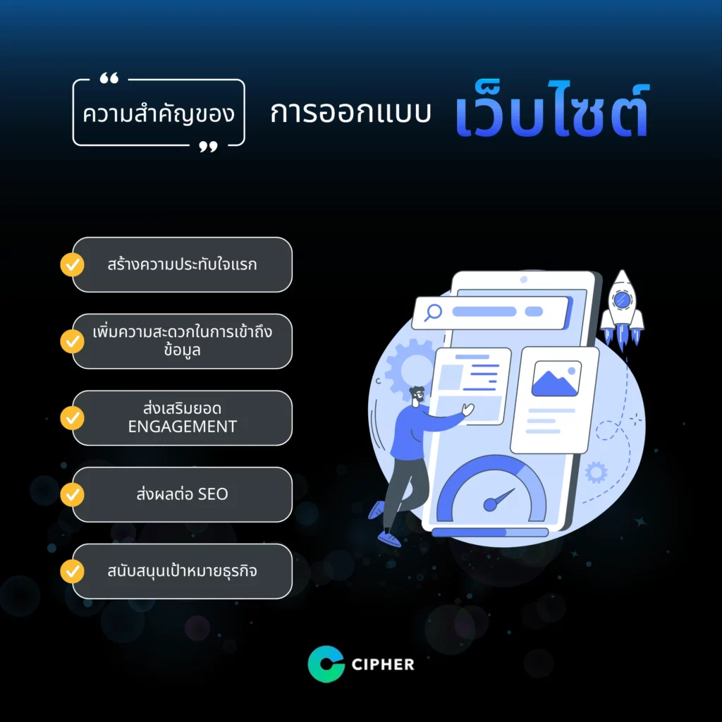
- Make a first impression: The website is the first channel that users often encounter with your business or brand. Good, easy-to-use design gives users a good first impression, promote reliability and build trust.
- Ease of Access: Users often come to find information of interest. If a website is designed to meet the requirements, such as navigation or properly categorized information, it reduces complexity and allows users to quickly access what they want.
- Engagement: Sites that meet user needs, such as device-friendly design or responsive design, with interesting and interactive content, will allow users to stay on the site longer and may increase the opportunity to transform visitors into customers.
- Affects SEO: Google’s search engine focuses on UX and website structure, such as speed of loading, mobile usage and content placement. If designed to meet the requirements, it increases search ranking, making your website more likely to be seen.
- Support business objectives: Easy-to-use, user-friendly websites help increase the possibility of conversions such as subscriptions, purchases and forms. All of which are important business goals and reduce the exit rate of websites.
Key website design principles that CIPHER uphold
Having a website that meets the needs of users is important. CIPHER focuses on designing websites that not only appeal to the eyes but also provide a great experience for users, based on the following key website design principles to create quality websites.
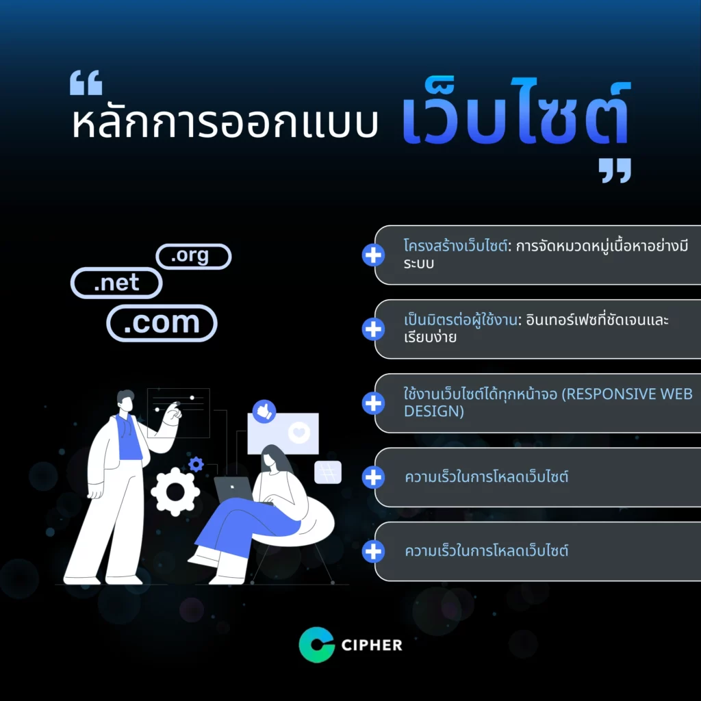
Site Structure
Good website structure not only makes it easier for users to find information but also improves website reliability and performance in the long run. CIPHER sees the website structure as the foundation that connects information to the issue and meets the needs of users.
- Systematic categorization of content: To enable users to quickly find the content they want, the content will be divided into related subcategories with clear priorities.
- Explicit Navigation: Cipher can be designed to make navigation easy to use, allowing users to access important content or pages in just a few clicks.
- SEO Consideration for Site Structure Design: A good site structure makes it easier for search engines to gather information (crawl), which gives the site a high ranking opportunity on the search results page. CIPHER plans the structure by focusing on the elements that promote SEO.
User Friendly (User Friendly)
User Friendly website design means creating a website that is easy for users to use, convenient and responsive to quickly and efficiently reduce the complexity and processes. CIPHER aims to provide the best user experience, such as:
- Clear and simple interface: Designed to be easy to understand and simplified
- Component Selection: Considering color, font, and icons that clearly convey meaning
- Powerful search engine: Designing a search function is easy to use and can display clear results and has filters that help meet your needs.
The website is available on all screens (Responsive Web Design).
In an era where users access websites through a variety of devices, such as mobile devices, tablets, or desktops, the concept of Responsive Web Design allows websites not only to be beautiful but also to increase the effectiveness of responding to a variety of users and establishing credibility in the online world. CIPHER adheres to the Responsive Web Design principle, such as
- Layout: Content and components are automatically modified to suit the device in use.
- Mobile device usage: On the mobile screen, vertical layout of content is emphasized for easy readability.
- Quality Test: CIPHER tests websites on a variety of devices to ensure that the user experience is not interrupted.
Fast Loading Time (Fast Loading Time)
The speed of the website directly affects the user experience and the SEO rating. Slowly loaded websites will cause dissatisfaction and may leave the website. CIPHER uses various techniques to speed up, such as:
- Minimizing image files: Use compressed images without loss of quality, such as WEBP format.
- Select High Quality Server: CHIPHER selects a server with speed and stability.
- Review and improve: CHIPHER places importance on site structure planning and uses effective testing tools and site performance monitoring after development to ensure optimal load speed.
a design consistent with the brand
Designing a website in harmony with the brand is one of the key strategies to create strong brand recognition and image. CIPHER focuses on the principles of website design that help create brand identity through website design, providing all elements such as:
- Color and Logo Usage: If the brand has primary colors such as light green and white, CIPHER will focus on designs that extract such tones into buttons, menus and backgrounds. The logo will be placed in prominent positions such as the top left corner of the website.
- Fonts and font styles (Typography): Use fonts defined in the brand manual or fonts that fit the brand’s characteristics and have a font layout that makes text easy to read and look beautiful.
Techniques to design websites to meet user requirements
The user-friendly website design aims to create a user experience by allowing users to access content and functions easily, quickly and in accordance with their needs. The main techniques are as follows:
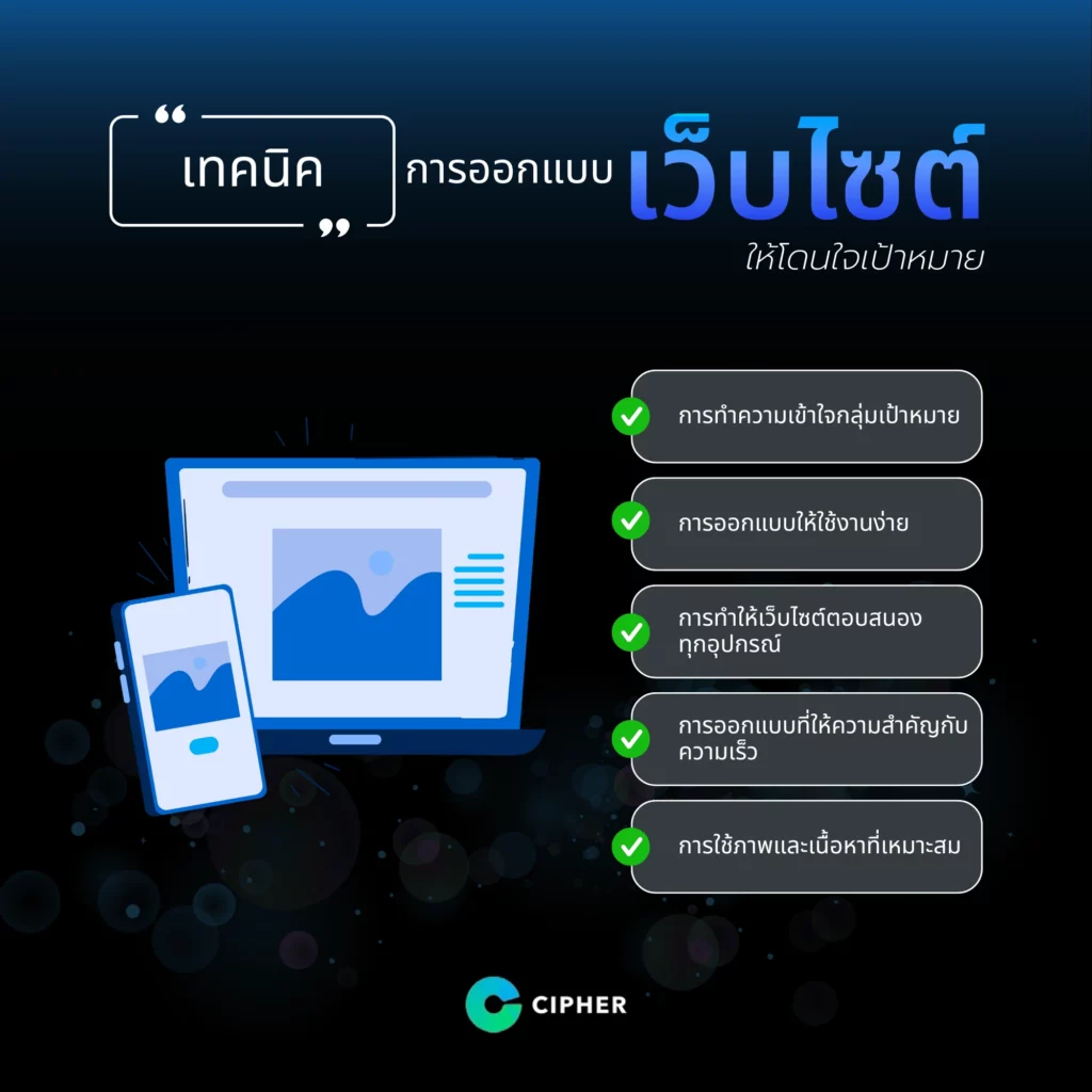
1. Understanding Target Groups
- Study the behavior and needs of users, such as who the target audience is. Use the device. What and what purpose did you visit the website for?
- Use marketing tools to analyze and analyze.
2. Easy-to-use design
- Navigation menu: Must be clear and easy to use, e.g. with the main menu displayed at the top or side.
- Use Simple Layout: for users to quickly find content.
- Add a Call-to-Action (CTA): such as “Subscribe” or “Contact Us” in an easy-to-see position.
3. Making websites responsive to all devices (Response Design)
- Use the Responsive Web Design technique to make websites display well on smartphones, tablets and desktops.
- Test the compatibility of websites on browsers and other devices such as mobile phones.
4. design that values speed
- Reduce the size of the CSS/JavaScript image, video, and code files to speed up loading.
- Use the cache system and CDN to distribute the data load and reduce response time.
5. Use of appropriate images and content (Visual and Content Design)
- It uses attractive images and videos, but does not slow the load.
- The content must be brief, concise and informative at the point of answering questions or solving user problems.
- Use easy-to-read fonts and accented colors.
CIPHER Successful Site Design Example
Lacoste, the world’s leading fashion brand with its crocodile-shaped logo, wants a website that reflects the brand’s unique style while supporting a variety of applications and meeting the needs of customers around the world.
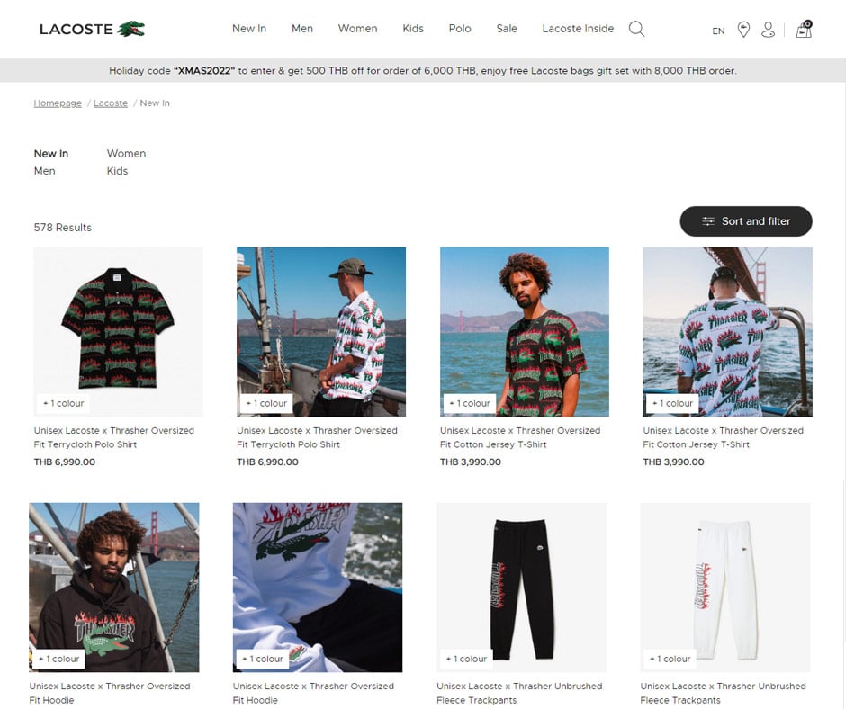
CIPHER has collaborated with Lacoste to design and develop a website that combines luxurious design with a great user experience. CHIPHER is based on a sleek UX/UI website with green, white and black tones, which is Lacoste’s signature color. That’s why the design of a website that is consistent with the brand not only increases sales but also strengthens the brand or business image.
Summary
CIPHER is committed to web design by providing web design and development services that focus on both user performance and user experience, structure, ease of use, speed and brand consistency, and template design & development services to make web sites attractive. This is an important part of creating a website that meets both users and business requirements. CIPHER is your partner in the development of an impressive website.