
In the online marketplace, getting customers to make purchasing decisions or take desired actions is not easy. While reaching your target audience might not be difficult, persuading them to take action as you hope is much more challenging. One technique that helps encourage customers to make decisions is using a CTA, or Call to Action. Let’s get to know and learn how to create effective Call to Action buttons together with CIPHER, which offers website design services tailored to your business needs.
Table of Contents
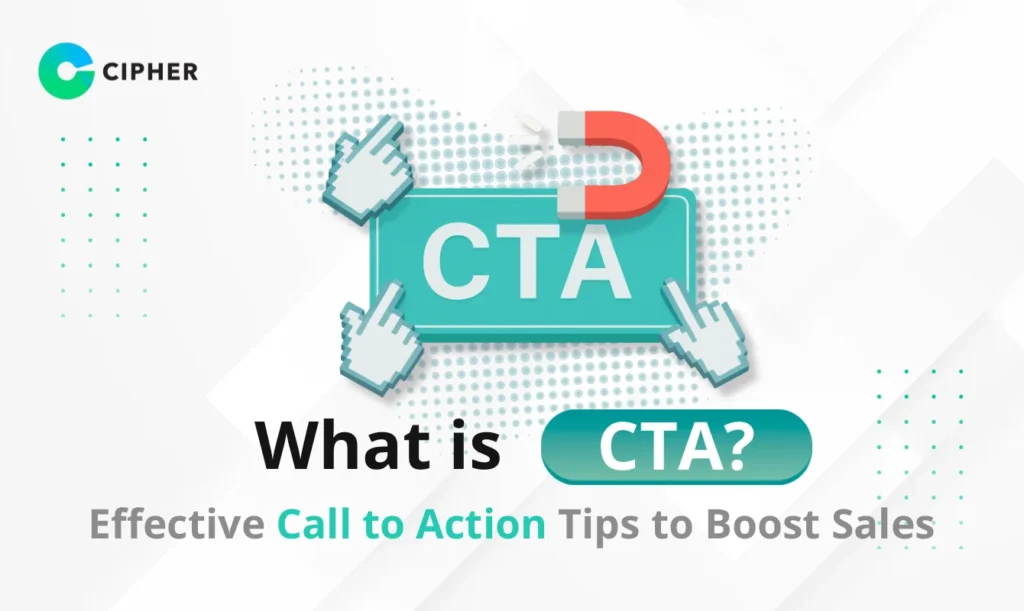
What is a CTA?
CTA or Call to Action is a prompt or written instruction used in marketing campaigns to encourage visitors to a websiteor followers to take a specific action. It typically appears as short text, clickable buttons, graphics, or links that lead to that action.
Call to Action consists of concise, straightforward phrases such as “Buy Now,” “Sign Up Today,” or “Download Free.” An effective Marketing CTA can increase Conversion Rate by more than 120%. Its purpose is to guide users from being merely visitors to becoming customers.
Why Use CTAs?
You might wonder why Call to Action buttons are so important for online businesses. Here are the key reasons why you should prioritize using Marketing CTAs in your online marketing:
- Eliminates Decision Confusion – With clear and straightforward messaging, CTAs tell customers what to do next and where to go, making the user journey more purposeful.
- Increases Traffic and Sales – Effectively designed Call to Action guides visitors to become followers and customers more easily, whether through social media follows, registrations, or product purchases.
- Makes Content More Meaningful – By attaching Action Calls to all content pieces, you ensure that content aligns with your overall marketing strategy and helps achieve business goals.
- Stimulates Sales Channels – Call to Action helps guide users through various stages of the buying process, making it easier for them to progress to the next step toward becoming customers.
- Customers Need CTAs – Users often rely on CTAs to know what to do next. Without CTAs, users may become confused, potentially harming your conversion rates.
- Enhances Digital Advertising Success – Strong, inspiring Marketing CTAs are key to improving the effectiveness of online advertisements, whether PPC ads or other forms of digital advertising.
What Makes a Good CTA?
Website design or various advertisements need well-designed CTAs for the best results. A good CTA should include these elements:
Simple - Focus on Simplicity
Quantity - Limit the Number
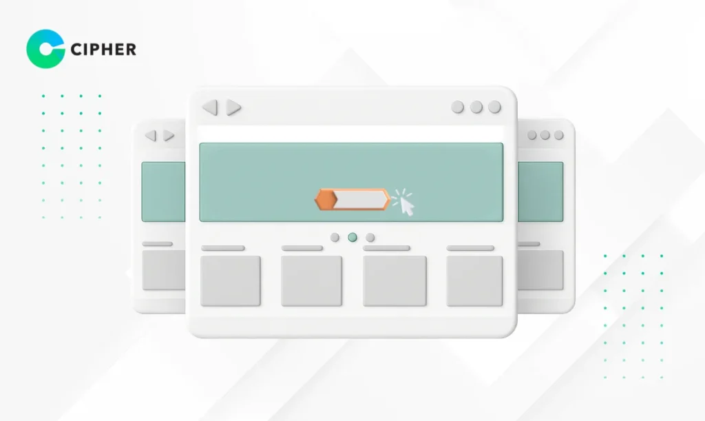
Image - Emphasize Visual Elements
Contrast - Be Different

How to Create Effective CTAs
1. Define Objectives
2. Choose Target Audience
3. Choose Appropriate Messaging
The words you choose for your Call to Action are extremely important. Here are tips for selecting effective words:
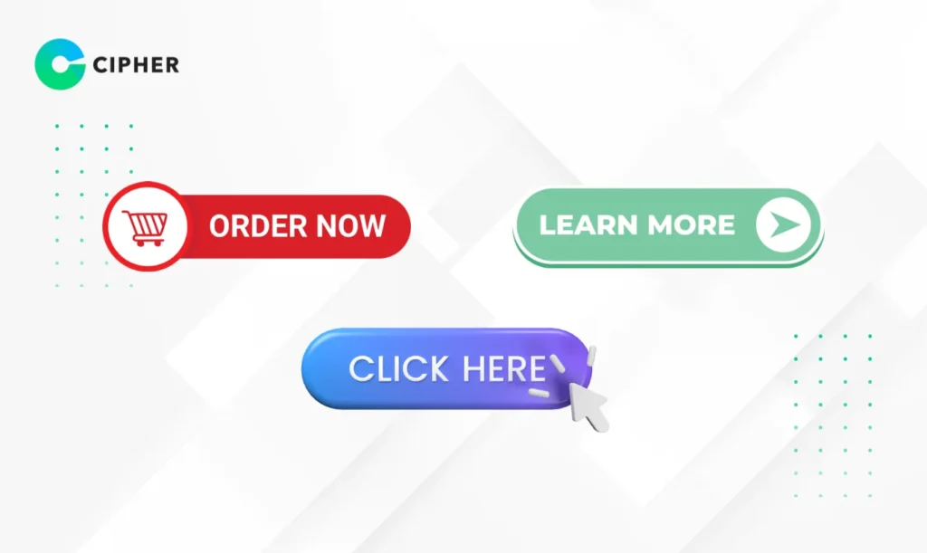
- Use Clear and Direct Words – Avoid using jargon or complex words; choose words that users understand immediately.
- Use Action Verbs – Words like “Buy,” “Register,” “Download,” or “Share” will prompt users to respond better.
- Create a Sense of Urgency – Use phrases like “Today Only,” “Limited Quantity,” or “Last Chance” to encourage users to make quick decisions.
- Use Friendly Language – Using pronouns like “You” and “We” helps create familiarity and makes the message more human.
- Keep it Short and Concise – A good CTA should communicate clearly with as few words as possible. Avoid using unnecessary or excessive words.
Choosing appropriate words will make your CTA powerful and encourage users to make decisions more easily.
4. Design Attractive CTAs
Design is another important factor that will make your Call to Action button stand out and attract attention. Things to consider when designing a CTA include:
- Choose Standout Colors – Use colors that contrast with the background and align with your Brand Identity.
- Design for Clickability – Make CTAs look like buttons with clear borders or shadows to give dimension and make them look clickable.
- Use Easy-to-Read Fonts – Choose fonts that are clear and easy to read. Avoid complex or difficult-to-read fonts.
- Add White Space – Surround CTAs with white space to make them stand out and not crowded with other elements.
- Test Different Sizes – Test various sizes of CTA buttons to find the most appropriate size—not too small to be visible, and not too large to be visually disruptive.
Designing CTAs that attract attention and are clickable will help increase conversion rates and lead to achieving your business goals.
5. Consider Appropriate CTA Placement
The position of a CTA greatly affects its effectiveness. You must consider the natural path of users on the webpage. Some people may want to buy or register immediately after seeing initial information, while others may want to read more details before deciding.
Popular positions for placing CTAs are:
- Above the fold – Place the CTA in the section users see immediately without scrolling down. Suitable for simple products or services that users already know well.
- Below the fold – Place the CTA after users have read information or product features. Suitable for complex products or services that require additional explanation.
- End of Page – Place the CTA at the end of the page so users can read all information before deciding.
- Multiple CTAs – Place CTAs at multiple points on the webpage so users can click whenever they’re ready, but be careful not to have too many.
Testing different positions and seeing which gives the best results is important, as user behavior may vary depending on the type of business and target audience.
6. Offer Incentives
Providing good reasons why users should click your CTA is important. Customers want to know what they’ll get when they follow your request. Incentives can take many forms, such as:
- Discounts – Offer special discounts for those who click the CTA.
- Free Gifts – Offer freebies or complementary products when purchasing goods or services.
- Premium Content – Offer special valuable content for those who sign up.
- Free Trial – Offer a free trial period for your service.
- Guarantees – Offer money-back guarantees or satisfaction guarantees.
Offering valuable incentives that match your target audience’s needs will increase the chances of CTA clicks and ultimately lead to customer conversions. Remember that incentives should be clear and easy to understand so users immediately see their value.
Web Design and Development Services for Online Business from CIPHER
Cipher Company Limited specializes in web design and development with CTAs as important elements that help boost sales. We offer comprehensive services:
- Websites with High-Performance CTAs – Design and develop standout Call to Action buttons that effectively stimulate purchasing decisions.
- Experience with Leading Brands – Portfolio of website and E-Commerce system development for many national brands.
- Marketing CTA Strategy Planning – Analyze consumer behavior and plan appropriate Call to Action strategies.
- User-Friendly UX/UI Design – Create good user experiences that are easy to use, emphasizing clearly visible Action Calls.
- High-Security Systems – Develop systems with high security, especially payment systems for E-Commerce businesses.
- Consultation on Creating Call to Action Buttons – Recommend techniques and methods for creating effective CTAs to increase conversion rates.
- Analysis and Improvement – Monitor and improve CTA efficiency with comprehensive SEO services continuously for the best results.
CIPHER is ready to help your business grow online with websites that are not only beautiful but can also effectively stimulate sales.
Conclusion
CTA is an important tool for increasing conversion rates and stimulating customer decisions. Effective Call to Action should be simple, appropriately numbered, use interesting images, and be distinctive. Creating good Marketing CTAs starts with setting clear objectives, choosing the right target audience, using powerful messaging, designing for clickability, placing appropriately, and offering interesting incentives.
Call to Action buttons aren’t just ordinary buttons but tools that guide customers throughout the purchasing journey. Continuously testing and improving CTAs is necessary to increase the effectiveness of online marketing and stimulate sales for sustainable business growth.