
A standout, memorable website often begins with choosing the perfect color palette. Colors don’t just make your website visually appealing; they also communicate your brand identity and create that crucial first impression with visitors. In this article, CIPHER, experts in web design and development, will guide you through ideas for selecting the right color palette for your business, along with techniques and tips to elevate your website to a more professional level.
Table of Contents
What is a Color Palette?
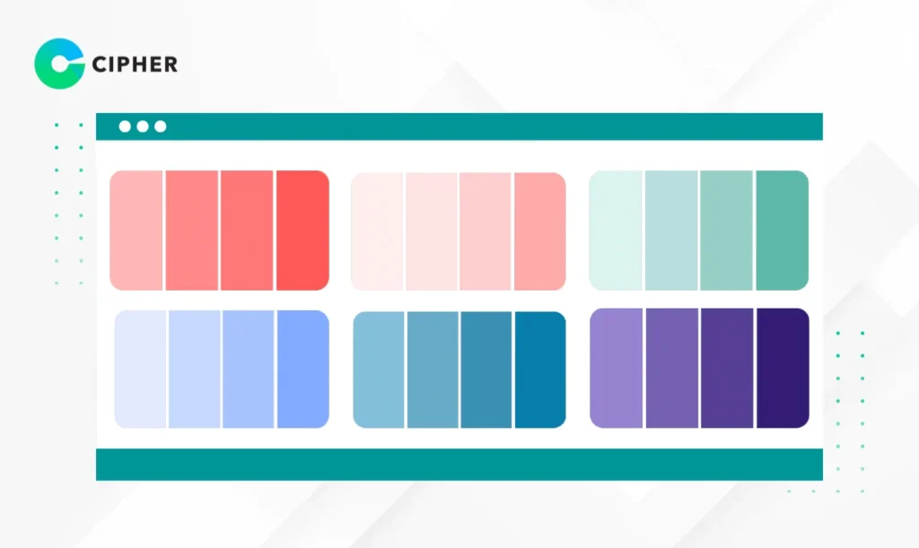
A color palette, or color scheme, is a group of colors carefully selected to work together systematically. Typically, it consists of 1-3 primary colors, 2-3 secondary colors, and accent colors used to draw attention to important elements.
A good color set should be harmonious and balanced, creating unity in website design and helping users easily understand which parts of the website are important. Color palettes are often displayed in standard color code formats like HEX, RGB, or HSL, allowing designers and developers to implement them precisely when creating websites.
Why is Choosing a Website Color Palette Important?
Choosing a color palette isn’t just about aesthetics; it affects users’ psychology and decision-making. Think about how you feel when you see Coca-Cola’s red or Facebook’s blue. These colors help create brand recognition and association. When selecting an appropriate color set, you’ll gain these benefits:
- Build credibility and professionalism – Websites with systematic color tones inspire confidence in visitors
- Communicate brand personality and values – Each color has psychological meaning; blue conveys trustworthiness, green signifies growth
- Make website navigation easier – Well-matched color combinations reduce eye fatigue and improve content readability
- Guide users to important website elements – Using distinctive accent colors for Call to Action buttons can increase click rates by up to 32%
These are the reasons why selecting a color palette is a crucial step in planning an effective website design and should be carefully considered from the beginning of the project.
How to Choose Colors for Your Website
Define Your Brand Target and Business Goals
Choose Colors Appropriate for Your Target Audience
Color selection should primarily consider the people who will use your website. Important factors to consider include:
- Age – Teenagers often appreciate bright colors, while adults may prefer calmer, more sophisticated tones
- Gender – Though there’s increasing diversity, generally, men may respond to darker and neutral colors, while women may prefer pastels and lighter colors
- Culture – Colors have different meanings in different cultures; for example, white symbolizes purity in Western cultures but may be associated with mourning in some Asian countries
A deep understanding of your target audience will help you choose a color palette that communicates effectively and creates a good first impression.
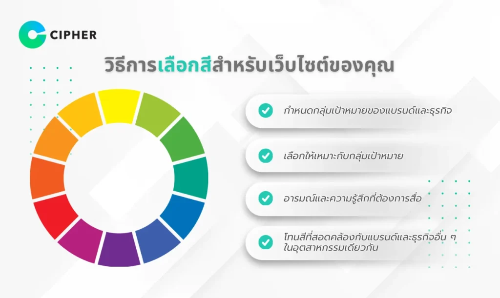
Emotions and Feelings You Want to Convey
Each color can trigger different emotions and feelings, with these psychological connections:
- Red: Stimulates excitement, energy, urgency, and passion
- Blue: Communicates trust, stability, expertise, and calmness
- Green: Represents growth, freshness, nature, and balance
- Yellow: Triggers happiness, optimism, energy, and creativity
- Purple: Reflects luxury, wisdom, mystery, and creativity
Consider how you want website visitors to feel, then choose colors that align with those feelings. Selecting colors that evoke the right emotions will enhance the user experience and create a connection with your brand.

Color Tones Consistent with Other Businesses in Your Industry
Exploring what competitors and industry leaders use for colors is important. You may want to:
- Follow industry standards – Some industries have standard color palettes, such as financial businesses often using blue, green, or gray
- Create differentiation – If all competitors use similar color tones, choosing a different color set might help your brand stand out
- Build familiarity – Sometimes using color palettes similar to the industry helps users feel familiar with and understand your services more quickly
It’s essential to balance uniqueness and industry standards to make your website both distinctive and easy to understand.
Color Palette Examples for Different Websites
Color Palettes for Health and Beauty Websites
Health and beauty websites should communicate cleanliness, calmness, and naturalness. Recommended color sets include:
- Primary colors: Light blue (#C7E5F6) and white (#FFFFFF)
- Secondary colors: Light green (#9ED9CC) and light gray (#F1F2F6)
- Accent colors: Mint green (#4ECCA3) or light pink (#FFD1DC)
These color tones help create a relaxing, clean, and professional atmosphere, suitable for websites of hospitals, clinics, spas, or beauty product brands that want to build trust and relaxation for users.
Color Palettes for Food and Beverage Websites
Food and beverage websites should stimulate appetite and promote freshness. Suitable color templates include:
- Primary colors: Brick orange (#E07A5F) or deep red (#B5332E)
- Secondary colors: Cream (#F2CC8F) and light green (#81B29A)
- Accent colors: Yellow (#F4E409) or bright red (#FF4500)
These colors often stimulate hunger, thirst, and communicate abundance, perfect for restaurants, cafes, or food brands wanting to create an appetizing atmosphere and attract customers.
Color Palettes for Clothing and Fashion Websites
Fashion websites need to look modern, stylish, and reflect brand identity. Suitable color sets include:
- Primary colors: Black (#000000) and white (#FFFFFF)
- Secondary colors: Light gray (#E0E0E0) and dark gray (#555555)
- Accent colors: Bright red (#FF0000) or pink (#FF69B4)
The white-black-gray palette is a classic choice that helps products stand out, while bright accent colors draw attention to promotions or new collections. Fashion websites using this color set will always look professional and modern.
Color Palettes for Technology and Innovation Websites
Technology websites should look modern, trustworthy, and communicate progress. Color sets recommended include:
- Primary colors: Dark blue (#2B2D42) and light gray (#8D99AE)
- Secondary colors: White (#FFFFFF) and dark gray (#333333)
- Accent colors: Bright blue (#00B4D8) or neon green (#4ADE80)
Blue and gray tones demonstrate reliability and professionalism, while bright colors communicate innovation and creativity. Technology websites using this color palette will look modern and credible.
Color Palettes for Finance and Banking Websites
Finance websites must demonstrate credibility, stability, and security. Appropriate color sets include:
- Primary colors: Dark blue (#00336E) or dark green (#004D40)
- Secondary colors: Light gray (#E8E9EB) and black (#000000)
- Accent colors: Gold (#FFD700) or silver (#C0C0C0)
Blue and green are commonly used in the financial industry because they communicate trust, while gold and silver represent wealth and success. Using these color tones will help build confidence in customers who want security in their transactions.
7 Websites for Matching Colors for Your Website
Designing a beautiful and user-friendly website doesn’t require you to be a color expert, as there are many online tools that will help you create the perfect color palette. Here are 7 color matching websites that we recommend:
- Adobe Color – Professional-level tool that lets you create color schemes based on color theory and can extract colors from images
- Coolors – Easy-to-use color palette generator; simply press spacebar to create new color sets until you find one you like
- Colormind – Uses AI to help create color templates and shows examples of actual usage on webpages
- Color Hunt – A library of thousands of ready-made color palettes categorized by style and color tone
- Canva Color Palette Generator – Tool for creating color combinations from images, perfect for drawing inspiration from existing images
- Khroma – AI tool that learns your taste and recommends color sets you might like
- Colorspace – Helps create harmonious color palettes from a single color; just enter a color code you like
Each website has different strengths. Try several to find the most suitable color combination for your project, and don’t forget to test with your actual target audience before making the final decision.
Web Design Services from CIPHER!
At CIPHER, we understand that your website is your business’s face in the online world. Beautiful design with a well-matched color palette is crucial to creating that first impression with customers.
With experience in web design and development for many leading brands, we have expertise in selecting color templates that aren’t just beautiful but also communicate brand values and meet your business goals.
Our services go beyond website design to include:
- Comprehensive digital marketing strategy planning
- UX/UI design focusing on user-friendliness and alignment with user behavior
- Full-service, secure E-Commerce website development
- SEO to help your website rank on Google
- Efficient social media management and online marketing
Regardless of your industry, our professional team is ready to help you create a beautiful, easy-to-use website that helps grow your business online.
Conclusion
Selecting an appropriate color palette is a crucial step in creating an impressive and effective website. A well-matched color set not only makes your website beautiful but also helps communicate brand personality, create a good user experience, and stimulate purchasing decisions.
If you need additional advice or assistance in website design and development, CIPHER’s team is ready to provide service with experience and expertise that will help elevate your business in the digital world. Contact us today to consult about your project!