
With the continuous increase in internet usage via smartphones and tablets, having a website that supports display across all devices has become essential. In this article, CIPHER, experts in website design and development, will guide you through Responsive Web Design, a web design technique that helps your business reach users anywhere, anytime, regardless of the device they use.
Table of Contents
What is Responsive Web Design?

Responsive Web Design is an approach to website design that enables appropriate display across devices with different screen sizes, whether computers, laptops, tablets, or smartphones. Responsive Design automatically adjusts the arrangement of elements on web pages to fit the user’s screen size.
When discussing Responsive Web Design, we’re talking about design that makes websites “respond” to the display environment. The website adapts to screen resolution and display orientation, providing users with the best experience regardless of their device.

Why is Responsive Web Design Important?
Today, there are more mobile internet users than desktop users. Making websites mobile-friendly or websites that can display like mobile applications is essential. Responsive websites not only help users access information conveniently but also affect website rankings in search results, as Google increasingly prioritizes mobile display.
Creating an effective Responsive website will help your business reach a wider customer base and create a good first impression when they visit your website.
Benefits of Responsive Web Design for Business
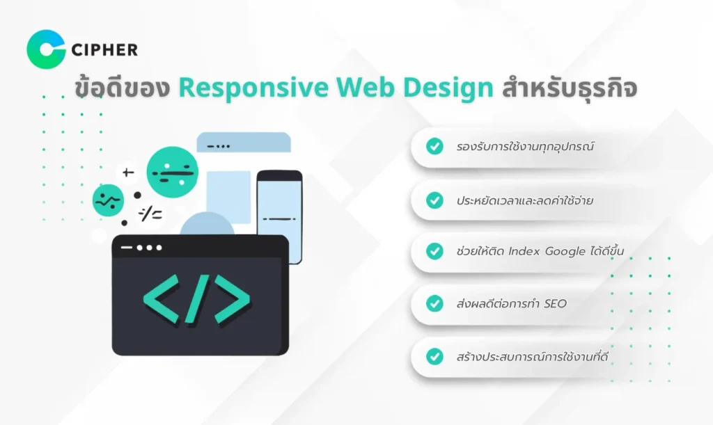
Support for All Devices
Time and Cost Savings
Improved Google Indexing
Positive SEO Impact
Having a single Responsive website version helps you avoid duplicate content issues, which can negatively affect SEO. It also makes managing URLs, backlinks, and website analytics easier.
Enhanced User Experience
What are the Limitations of Responsive Web Design?
Issues with Supporting Multiple Devices Simultaneously
Problems with Hiding Unnecessary Content
Image Resizing Issues
Security and Responsive Web Design
An often overlooked aspect of Responsive Web Design is security. A well-adapting website must consider protecting user data across all devices, including:
- Encrypting data sent between users and the website
- Protecting forms from attacks
- Ensuring the security of mobile payments
Cipher prioritizes developing highly secure Responsive websites, with experience in cybersecurity and ISO/IEC 27001 certification.
Responsive Web Design Techniques for Enhanced User Experience
Fluid Grid
Flexible Images
CSS Media Queries
Upgrade Your Website with Responsive Web Design at CIPHER!
If you’re looking for experts in creating Responsive websites who care about both design and security, CIPHER Company Limited is ready to serve you!
We have a team of experts experienced in developing Responsive Web Design that is not only beautiful and easy to use but also highly secure according to international ISO 9001:2015 and ISO/IEC 27001:2013 standards, which are globally recognized information security management standards.
Our services include:
- Designing and developing modern Responsive websites
- Improving existing websites to support display on all devices
- Checking and fixing website security issues
- Providing consultation on Responsive Web Design and security
Summary
Responsive Web Design is not just a trend but a new standard in website development essential for all businesses in the digital era. Having a Responsive website helps you reach more users, improve SEO, and create good experiences for users regardless of their device.
Don’t wait to modernize your website with Responsive Design, and if you need help from experts who emphasize both aesthetics, security, and services that help websites rank in SEO, CIPHER is always ready to serve you!

Frequently Asked Questions
What are the benefits of creating a Responsive website?
Creating a Responsive website offers these benefits:
- Users can access your website from any device
- Helps improve Google search rankings
- Cost-effective compared to creating separate mobile websites
- Reduces bounce rates
- Easier to maintain with just one set of code